How can we compare Adelie, Chinstrap, and Gentoo Penguins?
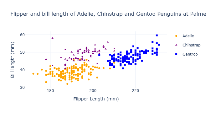
Above, we can see a striking graph comparing three beautiful penguins: The Adelie, the Chinstrap, and the Gentoo penguins. By creating three different shaped and colored dots, we can compare each type of penguin very easily by just looking at the graph. The yellow circles represent Adelie penguins, the purple triangles represent Chinstrap penguins, and the blue squares represent Gentoo penguins. With the x-axis representing the penguins’ Flipper lengths in millimeters and the y-axis represenfing the penguins’ Bill Lengths in millimeters, we can very easily see that the majority of penguins, regardless of the type, have quite proportional flipper:bill lengths. However, we can also observe that Gentoos have much longer flipper lengths than either of the other species.
How do we actually create this graph to make our comparisons?
We want to start off by importing pandas so that we can represent the dataframe in a way that’s easy for any reader to understand Then, we can actually import the dataframe and read it in as penguins
import pandas as pd
url = "https://raw.githubusercontent.com/pic16b-ucla/24W/main/datasets/palmer_penguins.csv"
penguins = pd.read_csv(url)
Below, we are importing some more tools that help us graph aspects of the data frame
import plotly.express as px
import plotly.graph_objects as go
import plotly.io as pio
import seaborn as sns
from matplotlib import pyplot as plt
From here, we can actually build our figures, so starting with Adelie penguins, we can represent a new dataframe only showing Adelie penguins, and give them unique plotting points We can then repeat for Chinstrap and gentoo penguins
Note: be sure to include the update_traces() to be able to create the legend. Without this legend, viewers of the graph will not be able to differentiate which points represent which penguin!
fig1 = px.scatter(penguins[penguins['Species'] == 'Adelie Penguin (Pygoscelis adeliae)'],
                  x = "Flipper Length (mm)",
                  y = "Culmen Length (mm)",
                  color = "Species",
                  color_discrete_sequence=["orange"], )
fig1.update_traces(
    marker = dict(symbol = "circle"),
    name = "Adelie")

fig2 = px.scatter(penguins[~penguins['Species'].isin(['Adelie Penguin (Pygoscelis adeliae)','Gentoo penguin (Pygoscelis papua)'])],
                  x = "Flipper Length (mm)",
                  y = "Culmen Length (mm)",
                  color = "Species",
                  color_discrete_sequence=["purple"])
fig2.update_traces(
    marker = dict(symbol = "triangle-up"),
    name = "Chinstrap")

fig3 = px.scatter(penguins[penguins['Species'] == 'Gentoo penguin (Pygoscelis papua)'],
                  x = "Flipper Length (mm)",
                  y = "Culmen Length (mm)",
                  color = "Species",
                  color_discrete_sequence=["blue"])
fig3.update_traces(
    marker = dict(symbol = "square"),
    name = "Gentroo")
Once each penguin is represented in their own dataframes to create their own figures, we’re going to combine them into one graph so we can overlay the data ontop of each other to create an easier mode of comparing, and then show the actual graph with the .show() function
fig4 = go.Figure(data=fig1.data + fig2.data + fig3.data)
fig4.update_layout(title_text=f"Flipper and bill length of Adelie, Chinstrap and Gentoo Penguins at Palmer Station",
                   xaxis_title="Flipper Length (mm)", yaxis_title="Bill length (mm)")
fig4.show()